
TYPO3 CMS Audit Issues
The most important tasks for editors in the TYPO3 backend have been tested against WCAG 2.1, conformance level AA. In detail, the following tasks are covered in this audit: Login, Login password reset, Module Menu left, Search, Create new page element: Page, Create new page element: Shortcut, Create new page element: External URL, Delete page, Create content element: Header Only, Create content element: Regular Text Element, Create content element: Text & Images, Create content element: Images Only, Create content element: Text & Media, Edit page content, Delete content element.
The status, if a task passes or fails a WCAG success criterion, is documented in the WCAG-EM Report. If a success criterion has status failed, the TYPO3 Issue-ID is referenced and the issue itself is described in detail on this page.
TYPO3-1 Incorrect keyboard focus order in tab menus
Pages/Tasks
- Create new page element: Page
- Create new page element: Shortcut
- Create new page element: External URL
- Create content element: Header Only
- Create content element: Regular Text Element
- Create content element: Text & Images
- Create content element: Images Only
- Create content element: Text & Media
Affected WCAG 2.1 Success criterions
- 2.1.1 Keyboard A
Affected components
- Tab menu
Description
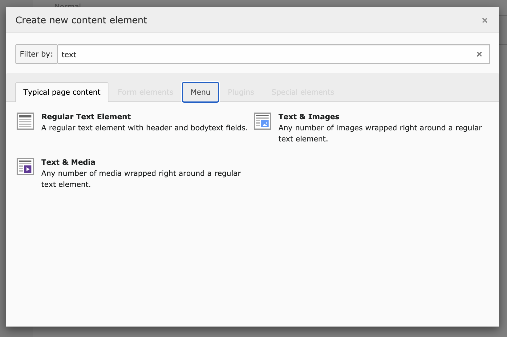
When you have a tab menu, e.g. with the user settings or the modal "Create new content element", you see a tab menu with "Typical page content", "Form elements", "Menu", etc.
The tab order for this component is incorrect. First you tab through the tab menu, then you tab through the content of the focused tab.
Correct would be: when focusing a tab menu, the next focusable element should be the content of this tab. Navigating through the tab menu should work with arrow keys.
Recommendation
The following keyboard rules should be implemented for tab menus:
- Tab: When focus moves into the tab list, places focus on the active tab element. When the tab list contains the focus, moves focus to the next element in the page tab sequence outside the tablist, which is typically either the first focusable element inside the tab panel or the tab panel itself.
When focus is on a tab element in a horizontal tab list:
- Left Arrow: moves focus to the previous tab. If focus is on the first tab, moves focus to the last tab. Optionally, activates the newly focused tab (See note below).
- Right Arrow: Moves focus to the next tab. If focus is on the last tab element, moves focus to the first tab. Optionally, activates the newly focused tab (See note below).
When focus is on a tab in a tablist with either horizontal or vertical orientation:
- Space or Enter: Activates the tab if it was not activated automatically on focus.
- Home (Optional): Moves focus to the first tab. Optionally, activates the newly focused tab
- End (Optional): Moves focus to the last tab. Optionally, activates the newly focused tab
See implementation example here:
https://www.w3.org/TR/wai-aria-practices/examples/tabs/tabs-2/tabs.html

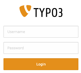
TYPO3-3 Placeholder text has insufficient color contrast
Pages/Tasks
- Login
- Login password reset
- Create new page element: Page
- Create new page element: Shortcut
- Create new page element: External URL
Affected WCAG 2.1 Success criterions
- 1.4.3 Contrast (Minimum) AA
Affected components
- Text input
Description
The minimum contrast ratio also applies to the color of placeholder texts of form fields. The contrast of the placeholder texts "Username" and "Password" is too low with a contrast ratio of 1.4:1, see WebAIM Color Contrast Checker.
Recommendation
Increase the contrast of the placeholder text to minimum ratio of 4.5:1.
TYPO3-4 Login and "Get Reset Link"-Button has insufficient color contrast
Pages/Tasks
- Login
- Login password reset
Affected WCAG 2.1 Success criterions
- 1.4.3 Contrast (Minimum) AA
Affected components
- Button
Description
The contrast of the login and "Get Reset Link" button is too low. It has a contrast ratio of 2.39, see WebAIM Color Contrast Checker0
<button class="btn btn-block btn-login t3js-login-submit" id="t3-login-submit"
type="submit" name="commandLI" data-loading-text="<i class='fa fa-circle-o-notch
fa-spin'></i> Verifying Login Data ..." autocomplete="off">
  Login
</button>

<button class="btn btn-block btn-login" type="submit" name="forgetPasswordSubmit">
  Get Reset Link
</button>
Recommendation
Increase the contrast to a contrast ratio of minimum 4.5:1.

TYPO3-5 Linked TYPO3-Logo has no discernible text
Pages/Tasks
- Login
- Login password reset
Affected WCAG 2.1 Success criterions
- 2.4.4 Link Purpose (In Context) A
- 4.1.2 Name, Role, Value A
Affected components
- Link
Description
Screenreader don't know the purpose of the link because the linked TYPO3 logo has no discernible text.
<a href="https://t3version10.ddev.site/typo3/" id="t3js-login-url" data-referrer-check-enabled="1">
  <img src="/typo3/sysext/backend/Resources/Public/Images/typo3_orange.svg" class="typo3-login-image" alt="">
</a>
Recommendation
Insert a discernible text "TYPO3 Login" for this link. You can archieve this with one of the following techniques:
- add the link purpose to the attribute alt of the <img>-Tag
- add the attribute aria-label to the <a>-Tag
- add a screenreader-only text between the opening and closing a-Tag
- add the attribute aria-labelledby to the <a>-Tag
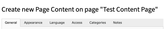
TYPO3-42 Create new Page Content Heading doesn't include content type
Pages/Tasks
- Create content element: Header Only
- Create content element: Regular Text Element
- Create content element: Text & Images
- Create content element: Images Only
- Create content element: Text & Media
Affected WCAG 2.1 Success criterions
- 2.4.6 Headings and Labels AA
Affected components
- Text
Description
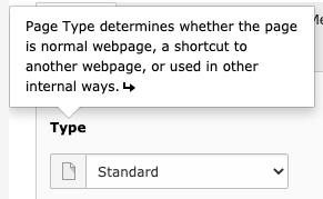
Headings and labels must describe the topic or purpose. The Headline for all "Create new Page Content"-Elements is called "Create new Page Content on page "Page Name"".
<h1>Create new Page Content on page "Page Name"</h1>
Recommendation
To fix this issue insert the content type in the headline, e.g.:
<h1>Create new Page Content "Header Only" on page "Page Name"</h1>
TYPO3-40 Inputs with charcounter misses correct markup for alert output, info has insufficient color contrast
Pages/Tasks
- Create new page element: Page
- Create new page element: Shortcut
- Create new page element: External URL
- Create content element: Header Only
- Create content element: Regular Text Element
- Create content element: Text & Images
- Create content element: Images Only
- Create content element: Text & Media
Affected WCAG 2.1 Success criterions
- 1.4.3 Contrast (Minimum) AA
- 3.3.1 Error Identification A
- 3.3.3 Error Suggestion AA
- 4.1.3 Status Messages (WCAG 2.1) AA
Affected components
- Text input
Description
There are two problems regarding inputs with charcounter:
- When focusing the input an information is visually displayed underneath the input called "Remaining characters: 255". Such warnings and suggestions for form inputs need to have a special markup, so that also screenreader users are aware of the existence of such a warning. The alert message is not marked up correctly for screenreader users.
- The info underneath the input has insufficient color contrast of 2.46 (background color: #6EABDD, foreground color: #ffffff), see: WebAIM Color Contrast Checker
<input type="text" id="formengine-input-5f63c599d8739873086267" class="form-control t3js-clearable hasDefaultValue t3js-charcounter-initialized" ...
Recommendation
To fix the issues, apply the following implementation:
- Use the ARIA role="alert" with the input.
- Ensures the contrast between foreground and background colors meets a contrast ratio of 4.5:1.
TYPO3-6 Delete button in the text input field is not accessible
Pages/Tasks
- Login
- Login password reset
- Create new page element: Page
- Create new page element: Shortcut
- Create new page element: External URL
- Create content element: Header Only
- Create content element: Regular Text Element
- Create content element: Text & Images
- Create content element: Images Only
- Create content element: Text & Media
- Search
Affected WCAG 2.1 Success criterions
- 4.1.2 Name, Role, Value A
- 1.4.11 Non-Text Contrast (WCAG 2.1) AA
Affected components
- Button
Description
When you type in a text input field, a button with a "x" appears at the end of the input field.
<button type="button" tabindex="-1" class="close" style="visibility: visible;">
With this button the user can delete the text in the input field. This button has several accessibility problems:
- The user cannot reach the button with the keyboard.
- The button has no discernable text for screenreader users.
- The contrast ratio of the "x" icon on white background is too low. It has a contrast ratio of 1.5:1, see WebAIM Color Contrast Checker. Input fields with dark background and white font color are not affected by this issue.
Recommendation
- Delete tabindex="-1" from the <button>, so the user can reach it with the keyboard.
- Provide a discernible text "delete Username from input field", "delete Password from input field" for the button. Achieve this with one of the following options.
- Inner text that is discernible to screen reader users.
- Non-empty aria-label attribute.
- Aria-labelledby pointing to element with text which is discernible to screen reader users.
- Increase the contrast ratio of the "x" to a minimum value of 1:3.
TYPO3-7 Status text on the login button is not readable when resized
Pages/Tasks
- Login
Affected WCAG 2.1 Success criterions
- 1.4.4 Resize Text AA
Affected components
- Button
Description
A user should be able to resize a website up to 200% without text getting clipped or truncated. When the user clicks on the login button, the button text changes to "Verifying Login data ...". When text is resized to 200%, this button text is not fully readable anymore.
Recommendation
Remove the CSS-Style white-space: nowrap; from the button. This will break the button text into multiple lines and automatically adjust the height of the button.

TYPO3-8 Login button has an invalid attribute
Pages/Tasks
- Login
Affected WCAG 2.1 Success criterions
- 4.1.1 Parsing A
Affected components
- Button
Description
The login button contains the attribute "autocomplete" which is not allowed with <button>.
<button class="btn btn-block btn-login t3js-login-submit" id="t3-login-submit" type="submit" name="commandLI" data-loading-text="<i class='fa fa-circle-o-notch fa-spin'></i> Verifying Login Data ..." autocomplete="off">
  Login
</button>
Recommendation
Remove the attribute "autocomplete" from the button.
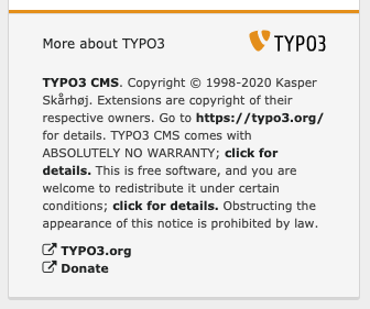
TYPO3-9 Link purpose of links in collapsable area "More about TYPO3" is not discernible with the given link text
Pages/Tasks
- Login
- Login password reset
Affected WCAG 2.1 Success criterions
- 2.4.4 Link Purpose (In Context) A
Affected components
- Link
Description
When you click on "More about TYPO", additional text is shown on the screen. This text contains links with an unclear link purpose.
A link should always have a unique discernible text, so all users know the link purpose. A Screenreader user often tabs from link to link and gets the link text read out loud. If the link text is "click here", the purpose of the link is not discernible if the user doesn't read the whole paragraph.
The link text of the following links should be improved:
- https://typo3.org/
- click for details
<a href="https://typo3.org/typo3-cms/overview/licenses/" target="_blank" rel="noreferrer">click for details.</a>
- click for details
<a href="https://typo3.org/typo3-cms/overview/licenses/" target="_blank" rel="noreferrer">click for details.</a>
Recommendation
Add a link text, which describes the link purpose.
- add "TYPO3 Website" as link text, instead of the url
- replace "click for details" with "details about licences"
- replace "click for details" with "details about licences"
TYPO3-10 Purpose of form input cannot be programmatically determined
Pages/Tasks
- Login
- Login password reset
Affected WCAG 2.1 Success criterions
- 1.3.5 Identify Input Purpose (WCAG 2.1) AA
Affected components
- Text input
Description
For user related form inputs, it should be possible, to programmatically identify the purpose of the form input.
On the login page, there are two form inputs without a defined purpose, because they are missing the autocomplete attribute:
- Username
- Password
On the password reset page, there is one form input without a defined purpose:
Recommendation
Add the correct HTML autocomplete attribute to the form inputs:
- autocomplete="username"
- autocomplete="current-password"
- autocomplete="email"
See list of autocomplete attributes: https://www.w3.org/TR/WCAG21/#input-purposes
TYPO3-11 Caps lock image misses correct markup for status output, has duplicate content in title and overlaps delete button
Pages/Tasks
- Login
Affected WCAG 2.1 Success criterions
- 3.3.1 Error Identification A
- 3.3.3 Error Suggestion AA
- 4.1.3 Status Messages (WCAG 2.1) AA
Affected components
- Text input
Description
When a user has the caps lock key activated and types text into the form input for username or password, an image appears on the right side of the form input.
<div class="form-notice-capslock t3js-login-alert-capslock">
  <img src="/typo3/sysext/backend/Resources/Public/Images/icon_capslock.svg"
width="14" height="14" alt="Attention: Caps lock enabled!" title="Attention: Caps lock enabled!">
</div>
There are several accessibility problems with this image:
- This image represents a warning to the user that the caps lock key is activated. Such warnings and suggestions for form inputs need to have a special markup, so that also screenreader users are aware of the existence of such a warning. This status message is not marked up correctly for screenreader users.
- The image is positioned at the same location as the delete button, so the delete button is not visible to sighted users anymore. Screenreader users still get the information that there is a button.
<button type="button" tabindex="-1" class="close" style="visibility: visible;">
- The title attribute of an image should be used for adding a long description for the image. In this case, the title and alt attribute have the same content and get read out twice by some screenreaders.
Recommendation
To fix the issues, apply the following implementation:
- Use the ARIA role="status" with the caps lock image.
- Align the delete button and the caps lock image in a way that both are visible.
- Use the title attribute of the image to provide a longer description, for example "If you activated the caps lock key accidentally, deactivate the key and enter the correct value again"
TYPO3-12 Form input has an insufficient color contrast ratio
Pages/Tasks
- Login
- Login password reset
Affected WCAG 2.1 Success criterions
- 1.4.11 Non-Text Contrast (WCAG 2.1) AA
Affected components
- Text input
Description
The form inputs for username and password have the border color #ccc. When the form inputs receive focus, the border color is #aaa. Both of those colors surrounded by white background have an insufficient contrast ratio of 2.3:1, see WebAIM Color Contrast Checker.
.input-login {
  border-color: #ccc;
}

.form-control:focus {
  border-color: #aaa;
}
Recommendation
To fulfill the minimum contrast ratio for form inputs, implement the following:
- increase the contrast ratio of the border color for the form inputs username and password to a minimum value of 3:1.
- increase the contrast ratio of the border color for the focussed form inputs username and password to a minimum value of 3:1.
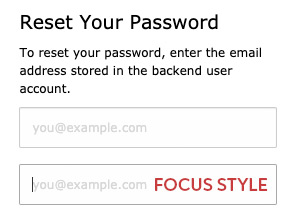
TYPO3-13 Login and "Get Reset Link" button have a missing focus style
Pages/Tasks
- Login
- Login password reset
Affected WCAG 2.1 Success criterions
- 2.4.7 Focus Visible AA
Affected components
- Button
Description
When you navigate with your keyboard to an interactive element, you should see a visible focus style. This success criterion helps to know which element has the keyboard focus. The login button doesn't change its style, when it receives focus.
<button class="btn btn-block btn-login t3js-login-submit" id="t3-login-submit" type="submit" name="commandLI" data-loading-text="<i class='fa fa-circle-o-notch fa-spin'></i> Verifying Login Data ..." autocomplete="off">
  Login
</button>

<button class="btn btn-block btn-login" type="submit" name="forgetPasswordSubmit">
  Get Reset Link
</button>
Recommendation
Add a visible focus style to the button. You can achieve this with one of the following examples:
- add a visible border to the button, when focussed.
- when focussed, change the button background color to another color, which has a contrast ratio of 3:1 to the normal background color.
- underline the button text, when focussed
TYPO3-14 Insufficient error validation and field information of form inputs
Pages/Tasks
- Login
Affected WCAG 2.1 Success criterions
- 1.3.1 Info and Relationships A
- 3.3.1 Error Identification A
- 3.3.2 Labels or Instructions A
- 3.3.3 Error Suggestion AA
Affected components
- Form
- Label
Description
The login form implements two error validations for the form inputs username and password: a JavaScript validation (when a form input is empty) and a server side validation (checking correct login credentials).
JavaScript validation
When the user leaves a form input empty and submits the form, an error is shown in the configured browser language, for example "Füllen Sie dieses Feld aus", see screenshot.
- The error description doesn't contain the name of the field, which needs to be filled.
- The error description does not programmatically identify the failed fields
Serverside validation
When the user enters the wrong credentials, a red error box on top of the form "Your login attempt did not succeed" appears. A screenreader user doesn't know about the error box on top of the form and therefore doesn't know what happened.
<div class="t3js-login-error" id="t3-login-error">
  <div class="alert alert-danger">
    <strong>Your login attempt did not succeed</strong>
    <p>Make sure to spell your username and password correctly, including upper/lowercase characters.</p>
  </div>
</div>
Field information
The form inputs include a hidden accessible name with the attribute aria-label="Username" and aria-label="Password", which is sufficient for the form input to have a name. Nevertheless, the only visible label is the placeholder text, which disappears, when the user clicks into the form input. For increasing the cognitive experience, the visible label should always be visible to sighted users.
Recommendation
JavaScript validation
- Include the name of the form input in the error message. For example: "Fill the field username".
- Relate the error message to the form input, for example by adding the error message to the label or adding attribute aria-describedBy="err_1" to the form input and marking the error with id="err_1". Add the attribute aria-invalid="true" to the form input.
Serverside validation
Add a markup for screenreaders to the red error box. Use one of the following techniques:
- add role="alert" to the surrounding div container with id="t3-login-error"
- add aria-live="assertive" to the surrounding div container with id="t3-login-error"
Field information
Add an explicit label to the form inputs username and password.
<label for="t3-username">Username:</label>
<input type="text" id="t3-username" name="username" value="" aria-label="Username" placeholder="Username" class="form-control input-login t3js-clearable t3js-login-username-field" autofocus="autofocus" required="required">
TYPO3-15 Insufficient labeling for search and password reset input
Pages/Tasks
- Search
- Login password reset
Affected WCAG 2.1 Success criterions
- 1.3.1 Info and Relationships A
- 4.1.2 Name, Role, Value A
Affected components
- Text input
Description
The search and password reset input have no associated label which can be determined programmatically.
<input type="text" class="form-control toolbar-item-search-field t3js-topbar-navigation-search-field" placeholder="Search" id="live-search-box" autocomplete="off">

<input type="email" name="email" value="" placeholder="you@example.com" class="form-control input-login t3js-clearable" autofocus="autofocus" required="required">
Recommendation
To fix this problem, the best way is to add a label to the inputs:
<label for="live-search-box">Search:</label>
<input type="text" class="form-control toolbar-item-search-field t3js-topbar-navigation-search-field" placeholder="Search" id="live-search-box" autocomplete="off">
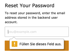
TYPO3-16 Insufficient error validation and field information of password reset input
Pages/Tasks
- Login password reset
Affected WCAG 2.1 Success criterions
- 1.3.1 Info and Relationships A
- 3.3.1 Error Identification A
- 3.3.2 Labels or Instructions A
- 3.3.3 Error Suggestion AA
Affected components
- Form
- Text input
- Label
Description
The password reset form implements a JavaScript error validation for the form input (when it is empty).
JavaScript validation
When the user leaves the form input empty and submits the form, an error is shown in the configured browser language, for example "Füllen Sie dieses Feld aus", see screenshot.
- The error description doesn't contain the name of the field, which needs to be filled.
- The error description does not programmatically identify the failed fields
Field information
The only visible label is the placeholder text (you@example.com), which disappears, when the user clicks into the form input. For increasing the cognitive experience, the visible label should always be visible to sighted users.
Recommendation
JavaScript validation
- Include the name of the form input in the error message. For example: "Fill the field Email address".
- Relate the error message to the form input, for example by adding the error message to the label or adding attribute aria-describedBy="err_1" to the form input and marking the error with id="err_1". Add the attribute aria-invalid="true" to the form input.
Field information
Add an explicit label to the form inputs username and password.
<label for="password-reset">Email address:</label>
<input type="email" id="password-reset" name="email" value="" placeholder="you@example.com" class="form-control input-login t3js-clearable" autofocus="autofocus" required="required">
TYPO3-17 Drag and drop menu is not accessible via keyboard
Pages/Tasks
- Create new page element: Page
- Create new page element: Shortcut
- Create new page element: External URL
Affected WCAG 2.1 Success criterions
- 2.1.1 Keyboard A
Affected components
- Menu
Description
It is not possible to add a new page in the Page view with the keyboard, the Toolbar Menu doesn't get keyboard focus.
<div class="tree-toolbar">
  <div class="svg-toolbar__submenu">
Recommendation
Add an alternative version for keyboard users, like the "Create new record" in the List view.
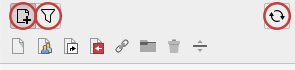
TYPO3-18 Create new pages, Filter and Reload buttons have missing focus style
Pages/Tasks
- Create new page element: Page
- Create new page element: Shortcut
- Create new page element: External URL
Affected WCAG 2.1 Success criterions
- 2.4.7 Focus Visible AA
Affected components
- Button
Description
When you navigate with your keyboard to an interactive element, you should see a visible focus style. This success criterion helps to know which element has the keyboard focus. The Create new pages, Filter and Reload buttons don't change its style, when it receives focus.
<button class="svg-toolbar__btn" data-tree-icon="actions-page-new" title="Create new pages">
  <span class="t3js-icon icon icon-size-small icon-state-default icon-actions-page-new" data-identifier="actions-page-new">
    <span class="icon-markup">
      <img src="/typo3/sysext/core/Resources/Public/Icons/T3Icons/actions/actions-page-new.svg" width="16" height="16" alt="">
    </span>
  </span>
</button>
Recommendation
Add a visible focus style to the buttons. You can achieve this with one of the following examples:
- add a visible border to the button, when focussed.
- when focussed, change the button background color to another color, which has a contrast ratio of 3:1 to the normal background color.
- underline the button text, when focussed
TYPO3-19 Help information is not visible, not accessible via keyboard and needs a close mechanism
Pages/Tasks
- Create new page element: Page
- Create new page element: Shortcut
- Create new page element: External URL
- Create content element: Header Only
- Create content element: Regular Text Element
- Create content element: Text & Images
- Create content element: Images Only
- Create content element: Text & Media
- Edit page content
- Search
Affected WCAG 2.1 Success criterions
- 1.4.13 Content on Hover or Focus (WCAG 2.1) AA
- 2.1.1 Keyboard A
- 4.1.1 Parsing A
Affected components
- Link
- Button
Description
Visibility
Most of the labels in the edit content section offer a help information, the user doesn't get aware of this information, only on mouse over the cursor changes into a question mark, the information opens in a tooltip via click.
Keyboard accessibility
Every interactive component must be accessible via keyboard, the help information is not accessible via keyboard.
In the search detail view all linked icons have information on mouse over, this information is not accessible via keyboard or read by screenreader.
Close mechanism
A mechanism must be available to dismiss the popup without moving pointer hover or keyboard focus.
Parsing
The span has a href attribute , which isn't allowed on span elements.
<span class="help-link" href="#" data-table="tt_content" data-field="header" data-loaded="false" data-html="true" data-original-title="Loading help..." data-placement="auto" data-trigger="click"><abbr class="help-teaser">Header</abbr></span>
Recommendation
Visibility
- Within the inputs use a separate button or icon to inform the user about the help information.
Keyboard accessibility
- Use an <a>- or <button>-tag to enable keyboard focus. Add an accessible tooltip logic.
Close mechanism
- Enable the esc-key to close the popups
- Use hover and focus pseudo classes in CSS, these can automatically get closed with the esc-key.
- Use role="tooltip"
Parsing
- Use an <a>-tag instead of the <span>-tag.
- Delete the href attribute.
TYPO3-21 The toggle search toolbar button has missing popup information
Pages/Tasks
- Create new page element: Page
- Create new page element: Shortcut
- Create new page element: External URL
Affected WCAG 2.1 Success criterions
- 2.4.4 Link Purpose (In Context) A
Affected components
- Button
- Link
Description
A menu button that offers a popup should inform the user about the popup, a button is revealed to assistive technologies as a menu button if it has the property aria-haspopup set to either menu or true.
<a href="#" class="btn btn-default btn-sm t3js-toggle-search-toolbox" title="Toggle search toolbar">
  <span class="t3js-icon icon icon-size-small icon-state-default icon-actions-search" data-identifier="actions-search">
    <span class="icon-markup">
      <img src="/typo3/sysext/core/Resources/Public/Icons/T3Icons/actions/actions-search.svg" width="16" height="16" alt="">
    </span>
  </span>
</a>
Recommendation
Use a <button>- instead of the <a>-tag and add the aria-haspopup and aria-controls attributes. Use an ID for the popup. Add the aria-expanded="true" attribute to the button when the menu is open.
<a aria-haspopup="true" aria-controls="search-toolbar" href="#" class="btn btn-default btn-sm t3js-toggle-search-toolbox" title="Toggle search toolbar">
  <span class="t3js-icon icon icon-size-small icon-state-default icon-actions-search" data-identifier="actions-search">
    <span class="icon-markup">
      <img src="/typo3/sysext/core/Resources/Public/Icons/T3Icons/actions/actions-search.svg" width="16" height="16" alt="">
    </span>
  </span>
</a>

<div id="search-toolbar" class="db_list-searchbox-form db_list-searchbox-toolbar module-docheader-bar module-docheader-bar-search t3js-module-docheader-bar t3js-module-docheader-bar-search" id="db_list-searchbox-toolbar" style="height: auto;">
TYPO3-20 Create new pages, Filter and Reload buttons have no descriptive text
Pages/Tasks
- Create new page element: Page
- Create new page element: Shortcut
- Create new page element: External URL
Affected WCAG 2.1 Success criterions
- 1.1.1 Non-text Content A
- 2.4.4 Link Purpose (In Context) A
Affected components
- Button
Description
When navigating to a button, a descriptive text must be presented to screen reader users to indicate the function of the button.
The Create new pages, Filter and Reload buttons use only the title attribute. Many user agents do not expose the title in an accessible manner as required by the specification (e.g. requiring a pointing device such as a mouse to cause a tooltip to appear, which excludes keyboard-only users and touch-only users, such as anyone with a modern phone or tablet).
<button class="svg-toolbar__btn" data-tree-icon="actions-page-new" title="Create new pages">
  <span class="t3js-icon icon icon-size-small icon-state-default icon-actions-page-new" data-identifier="actions-page-new">
    <span class="icon-markup">
      <img src="/typo3/sysext/core/Resources/Public/Icons/T3Icons/actions/actions-page-new.svg" width="16" height="16" alt="">
    </span>
  </span>
</button>
Recommendation
Place text content within the <button> element. You can achieve this with one of the following examples:
- Add an alt-text to the image in the button
- Keep the title-Attribute and add an extra text for screenreader users <span class="sr-only">Text</span>
TYPO3-22 Form elements have insufficient color contrast and focus style
Pages/Tasks
- Create new page element: Page
- Create new page element: Shortcut
- Create new page element: External URL
Affected WCAG 2.1 Success criterions
- 1.4.11 Non-Text Contrast (WCAG 2.1) AA
- 2.4.7 Focus Visible AA
Affected components
- Text input
- Select
- Checkbox
- Radio Button
- Textarea
Description
The form elements in the Edit section have the border color #bbb. When the form elements receive focus, the border color is #aaa. Both of those colors surrounded by the background color #ededed have an insufficient contrast ratio of 1.98:1, see WebAIM Color Contrast Checker
When the form elements receive focus, the elements get a subtle box-shadow and the border-color changes from #bbb to #aaa, which is an insufficient contrast change from 1.21:1, see WebAIM Color Contrast Checker
<input type="text" id="formengine-input-5f4f81c03275a289922782" class="form-control t3js-clearable hasDefaultValue t3js-charcounter-initialized"
.form-control {
  border: 1px solid #bbb;
}

.form-control:focus {
  border-color: #aaa;
  outline: 0;
  box-shadow: 0 0 8px rgba(170,170,170,.6);
}
Recommendation
To fulfill the minimum contrast ratio for form inputs, implement the following:
- increase the contrast ratio of the border color for the form inputs and selects to a minimum value of 3:1.
- increase the contrast ratio of the border color for the focussed form inputs and selects to a minimum value of 3:1.

TYPO3-24 Form elements are not associated with their labels
Pages/Tasks
- Create new page element: Page
- Create new page element: Shortcut
- Create new page element: External URL
- Create content element: Header Only
- Create content element: Regular Text Element
- Create content element: Text & Images
- Create content element: Images Only
- Create content element: Text & Media
Affected WCAG 2.1 Success criterions
- 1.3.1 Info and Relationships A
- 4.1.2 Name, Role, Value A
Affected components
- Text input
- Select
Description
The form elements have no associated label which can be determined programmatically. There is a visible label, but it is not programmatically associated. It affects all inputs and selects in the Edit section, here the first example:
<label class="t3js-formengine-label">
<span class="help-link" href="#" data-table="pages" data-field="doktype" data-loaded="false" data-html="true" data-original-title="Loading help..." data-placement="auto" data-trigger="click"><abbr class="help-teaser">Type</abbr></span>
</label>
<select id="tceforms-select-5f4f7cdd7beab524303445" name="data[pages][2][layout]" data-formengine-validation-rules="[{"type":"select","minItems":0,"maxItems":99999}]" class="form-control form-control-adapt">Recommendation
To fix this issue, reference all form element to their labels:
<label for="tceforms-select-5f4f7cdd7beab524303445" class="t3js-formengine-label"> <span class="help-link" href="#" data-table="pages" data-field="doktype" data-loaded="false" data-html="true" data-original-title="Loading help..." data-placement="auto" data-trigger="click"><abbr class="help-teaser">Type</abbr></span> </label>
<select id="tceforms-select-5f4f7cdd7beab524303445" name="data[pages][2][layout]" data-formengine-validation-rules="[{"type":"select","minItems":0,"maxItems":99999}]" class="form-control form-control-adapt">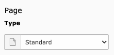
TYPO3-23 Frames must have a description
Pages/Tasks
- Create new page element: Page
- Create new page element: Shortcut
- Create new page element: External URL
- Create content element: Header Only
- Create content element: Regular Text Element
- Create content element: Text & Images
- Create content element: Images Only
- Create content element: Text & Media
- Edit page content
- Delete content element
Affected WCAG 2.1 Success criterions
- 4.1.2 Name, Role, Value A
Affected components
- Iframe
Description
Ensure that <iframe> and <frame> elements contain a description. The iframe #typo3-contentIframe is not described.
<iframe name="list_frame" id="typo3-contentIframe" scrolling="no" class="scaffold-content-module-iframe t3js-scaffold-content-module-iframe" src="/typo3/index.php?route=%2Fmodule%2Fweb%2Flayout&token=5eb683d1aec3126f768e42b3e138be8a84656bfe&id=2" style=""></iframe>
Recommendation
To describe the iframe, apply of the following implementation:
- add an aria-labelledby attribute and reference a visible element that describes the iframe
- add an aria-label attribute
- add a title attribute
TYPO3-25 t3js-contextmenutrigger has no descriptive text, tooltip and popup are not keyboard accessible
Pages/Tasks
- Create new page element: Page
- Create new page element: Shortcut
- Create new page element: External URL
- Create content element: Header Only
- Create content element: Regular Text Element
- Create content element: Text & Images
- Create content element: Images Only
- Create content element: Text & Media
- Edit page content
Affected WCAG 2.1 Success criterions
- 1.1.1 Non-text Content A
- 2.4.4 Link Purpose (In Context) A
Affected components
- Link
Description
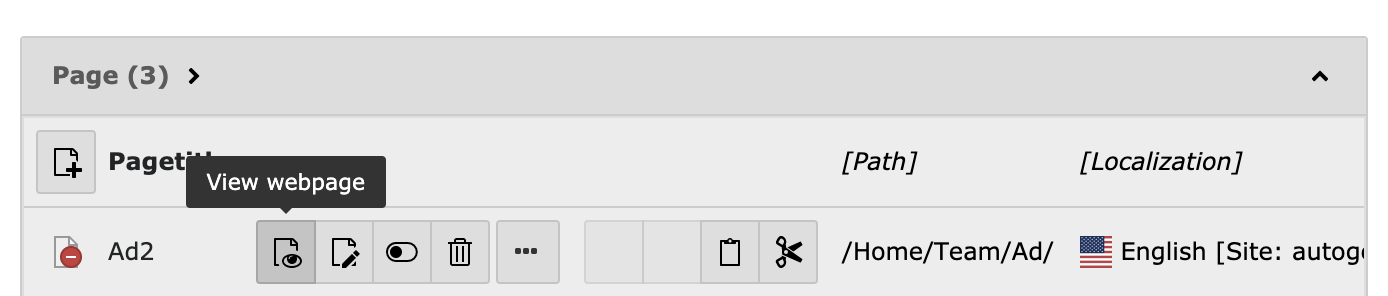
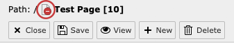
When navigating to a link, descriptive text must be presented to screen reader users to indicate the target of the link. The page icon in the path section has no descriptive text.
It has a tooltip and a popup, the tooltip is not accessible via keyboard. The popup can be opened with the keyboard enter-key, but focus doesn't switch into the popup menu.
<a href="#" class="t3js-contextmenutrigger" data-table="pages" data-uid="2">
  <span data-toggle="tooltip" data-title=" id=2<br>Hidden" data-html="true" data-placement="right" data-original-title="" title="">
    <span class="t3js-icon icon icon-size-small icon-state-default icon-apps-pagetree-page-default" data-identifier="apps-pagetree-page-default">
      <span class="icon-markup">
        <img src="/typo3/sysext/core/Resources/Public/Icons/T3Icons/apps/apps-pagetree-page-default.svg" width="16" height="16" alt="">
      </span>
      <span class="icon-overlay icon-overlay-hidden">
        <img src="/typo3/sysext/core/Resources/Public/Icons/T3Icons/overlay/overlay-hidden.svg" width="16" height="16" alt="">
      </span>
    </span>
  </span>
</a>
Recommendation
To describe the link add an alt-text to the image in the link or add a screenreader-text.
To get the popup menu accessible via keyboard use the following recommendations:
- Use a <button>-tag instead the <a>-tag and set aria-haspopup="true" and aria-controls="IDREF"
- Use element.focus() or aria-activedescendant to handle the focus order.
https://www.w3.org/TR/wai-aria-practices-1.1/examples/menu-button/menu-button-links.html
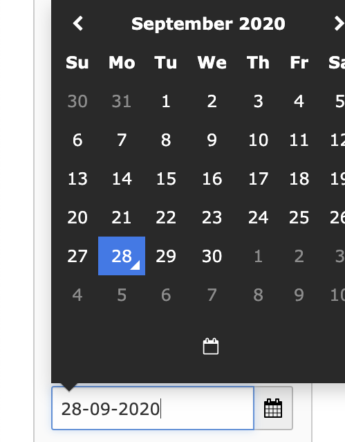
TYPO3-35 Date and time picker: month arrow buttons, time picker and today button not accessible via keyboard, not useable with screenreaders
Pages/Tasks
- Create new page element: Page
- Create new page element: Shortcut
- Create new page element: External URL
- Create content element: Header Only
- Create content element: Regular Text Element
- Create content element: Text & Images
- Create content element: Images Only
- Create content element: Text & Media
Affected WCAG 2.1 Success criterions
- 2.1.1 Keyboard A
Affected components
- Text input
Description
There are several problems with the date and time picker:
- The month arrow buttons, the time picker in total and the today button are not accessible via keyboard.
- When switching between the two date pickers from publish date and expiration date the date picking also doesn't work with the arrow keys anymore.
- The screenreader reads all text in den date picker popup in one line, when selecting a day he tells just the day, most time the wrong information.
Recommendation
Use an accessible date picker, like this one: https://dequeuniversity.com/library/aria/date-picker
Changes in datepicker.js made by us to make the datepicker fully accessible: Changes in JavaScript code for datepicker by Deque

TYPO3-34 No specific page title is used
Pages/Tasks
- Create new page element: Page
- Create new page element: Shortcut
- Create new page element: External URL
- Delete page
- Create content element: Header Only
- Create content element: Regular Text Element
- Create content element: Text & Images
- Create content element: Images Only
- Create content element: Text & Media
- Search
- Edit page content
Affected WCAG 2.1 Success criterions
- 2.4.2 Page Titled A
Affected components
- Text
Description
Web pages should have page titles that describe the topic or purpose, through the loading of the pages and the edit section with JavaScript the page title doesn't change.
Recommendation
To fix this issue, also change the page title when loading the pages with JavaScript.
document.title = "This is the new page title."
TYPO3-33 No skiplinks or bypass links are used
Pages/Tasks
- Create new page element: Page
- Create new page element: Shortcut
- Create new page element: External URL
- Delete page
- Create content element: Header Only
- Create content element: Regular Text Element
- Create content element: Text & Images
- Create content element: Images Only
- Create content element: Text & Media
- Search
- Module menu left
- Edit page content
- Delete content element
Affected WCAG 2.1 Success criterions
- 2.4.1 Bypass Blocks A
Affected components
- Link
Description
A mechanism should be available to skip or bypass blocks of content that are repeated on multiple views.
For repeated sections (listing of content elements, listing of search results, ...), skiplinks to skip each block of repeated content are missing.
Recommendation
Add links at the beginning of each block of repeated content to go to the end of the block.
Add an option to jump to a specific area of the backend (module selection, pagetree, content (iframe)) using a keyboard shortcut.
Jumping to an area actually should focus the first focusable element of the area.
It may be an idea to use a two level shortcut as others do:
- g-p for go to pagetree
- g-m for go to modules
- g-s for go to searchfield
- g-c for go to contentarea
When having this two level approach after the first level an information might be displayed for the available options.
TYPO3-27 Some elements in the Edit section are not accessible via keyboard
Pages/Tasks
- Create new page element: Page
- Create new page element: Shortcut
- Create new page element: External URL
- Create content element: Text & Images
- Create content element: Images Only
- Create content element: Text & Media
Affected WCAG 2.1 Success criterions
- 2.1.1 Keyboard A
Affected components
- Button
- Select
Description
All functionality of the content must be operable through the keyboard interface without requiring specific timings for individual keystrokes. Some elements in the Edit section are not accessible or can't be edited via keyboard:
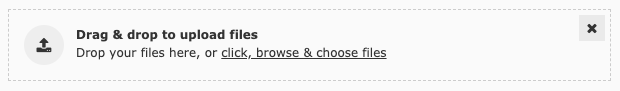
In Resources, Images or Media:
<span class="btn btn-default t3js-online-media-add-btn" ...
<div class="dropzone" style="">
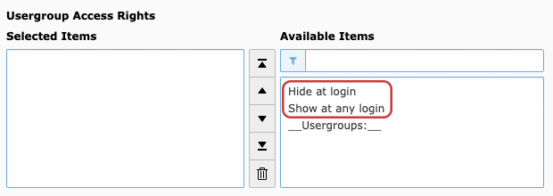
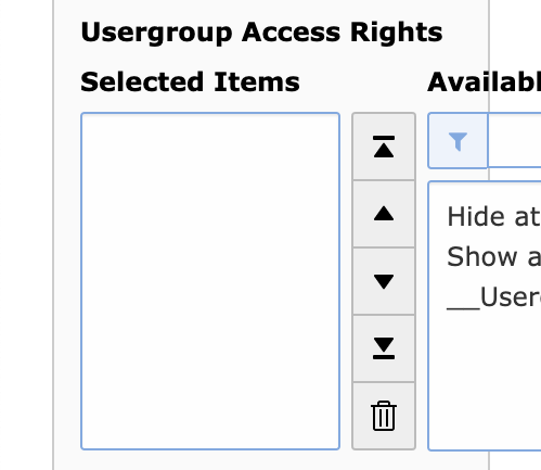
In Access/Usergroup Access Rights Available Items in the .form-wizards-element can't be added to the Selected Items.
<select data-relatedfieldname="data[tt_content][NEW5f72490c22539131545929][fe_group]" data-exclusivevalues="-1,-2" id="tceforms-multiselect-5f72490c47e6a419235057" data-formengine-input-name="data[tt_content][NEW5f72490c22539131545929][fe_group]" class="form-control t3js-formengine-select-itemstoselect" size="5" onchange="TBE_EDITOR.fieldChanged('tt_content','NEW5f72490c22539131545929','fe_group','data[tt_content][NEW5f72490c22539131545929][fe_group]');" data-formengine-validation-rules="[{"type":"select","minItems":0,"maxItems":20}]"><option value="-1" title="Hide at login" class="hidden" disabled="">Hide at login</option><option value="-2" title="Show at any login">Show at any login</option><option value="--div--" title="__Usergroups:__">__Usergroups:__</option></select>Recommendation
To fix this issue, add the following implementations:.
- Use <a>- or <button>-Tags to simply enable keyboard accessibility.
- Enable keyboard focus for the options in the <select>-Element.

TYPO3-74 Paste button in content edit page not accessible via keyboard
Pages/Tasks
- Edit page content
Affected WCAG 2.1 Success criterions
- 2.1.1 Keyboard A
Affected components
- Link
Description
Every interactive component must be accessible via keyboard, the paste button in the content edit page is not accessible via keyboard
<a data-content="6" data-title="6" data-severity="warning" class="t3js-paste t3js-paste-copy t3js-paste-after btn btn-default btn-sm" title="Paste after this record"><span class="t3js-icon icon icon-size-small icon-state-default icon-actions-document-paste-into" data-identifier="actions-document-paste-into">
Recommendation
To fix this issue, add one of the following implementations:
- Add tabindex="0" to the <a>-tag.
- Add a href-attribute to the <a>-tag.
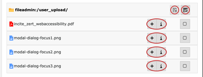
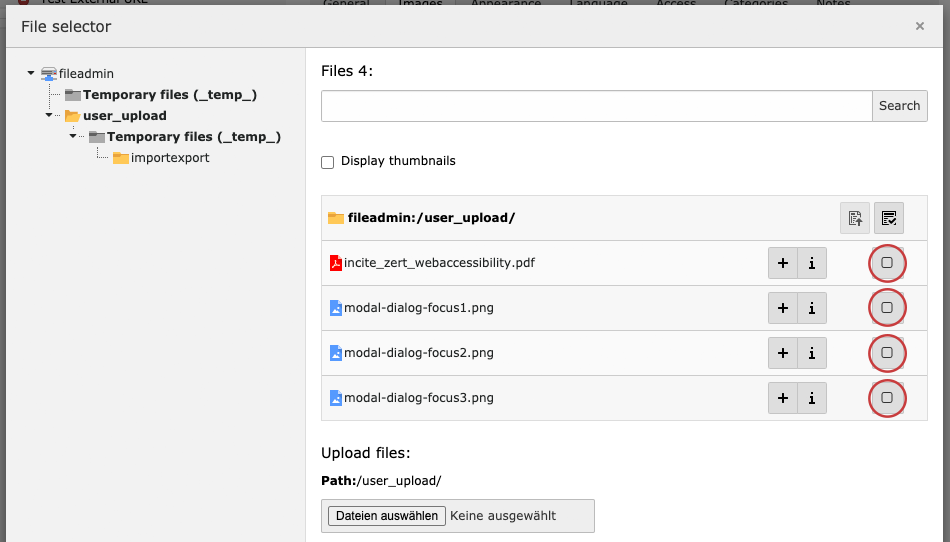
TYPO3-32 Elements in the modal dialog have insufficient focus style
Pages/Tasks
- Create new page element: Page
- Create new page element: Shortcut
- Create new page element: External URL
- Delete page
- Create content element: Header Only
- Create content element: Regular Text Element
- Create content element: Text & Images
- Create content element: Images Only
- Create content element: Text & Media
- Edit page content
- Delete content element
Affected WCAG 2.1 Success criterions
- 2.4.7 Focus Visible AA
Affected components
- Menu
- Button
Description
The elements in the modal dialog use the standard browser outline, which gets overlaid from the icons and crops the text, see screenshots. The close-button has opacity set to .5, so the contrast is very low.
.modal .close {
  opacity: .5;
}

:focus {
  outline: -webkit-focus-ring-color auto 1px;
}
Recommendation
- Use an individual focus style to avoid overlays
- Set close-button to opacity 1

TYPO3-31 Skip focus on disabled tabs for keyboard users
Pages/Tasks
- Create new page element: Page
- Create new page element: Shortcut
- Create new page element: External URL
- Create content element: Header Only
- Create content element: Regular Text Element
- Create content element: Text & Images
- Create content element: Images Only
- Create content element: Text & Media
Affected WCAG 2.1 Success criterions
- 2.1.1 Keyboard A
Affected components
- Tab menu
Description
When filtering types of content elements with the search input "Filter by:", all tabs with no results get disabled and you cannot click the disabled tabs with the mouse. But if you tab through the tab menu with your keyboard with the TAB key, the disabled tabs still get focus (see screenshot).
Goal: disabled tabs should not get keyboard focus.
Recommendation
Add tabindex="-1" to disabled tabs like this:
<li role="presentation" class="t3js-tabmenu-item disabled">
  <a href="#DTM-a31afc8fb6-3" title="" aria-controls="DTM-a31afc8fb6-3" role="tab" data-toggle="tab" tabindex="-1">Menu</a>
</li>
TYPO3-30 "Allowed file extensions" and "Proposal accepted" have an insufficient color contrast
Pages/Tasks
- Create new page element: Page
- Create new page element: Shortcut
- Create new page element: External URL
Affected WCAG 2.1 Success criterions
- 1.4.3 Contrast (Minimum) AA
Affected components
- Text
Description
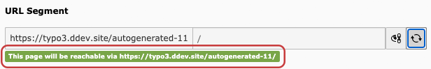
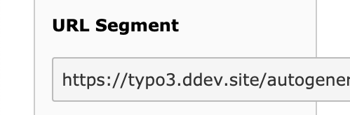
The contrast of the "Allowed file extensions" and "Proposal accepted" text in "URL Segment" is too low. It has a contrast ratio of 2.88. See WebAIM Color Contrast Checker.
<span class="label label-success">GIF</span> <span class="t3js-form-proposal-accepted label label-success">This page will be reachable via typo3.ddev.site/autogenerated-2<span>/</span></span>
Recommendation
Increase the contrast to a contrast ratio of minimum 4.5:1.
TYPO3-41 Some input elements are cut off when resized and cause horizontal scrolling
Pages/Tasks
- Create content element: Header Only
- Create content element: Regular Text Element
- Create content element: Text & Images
- Create content element: Images Only
- Create content element: Text & Media
Affected WCAG 2.1 Success criterions
- 1.4.4 Resize Text AA
- 1.4.10 Reflow (WCAG 2.1) AA
Affected components
- Form
- Text input
- Select
- File Upload
Description
A user should be able to resize a website up to 200% without text getting clipped or truncated. It mostly works when the user hides the .scaffold-content-navigation.
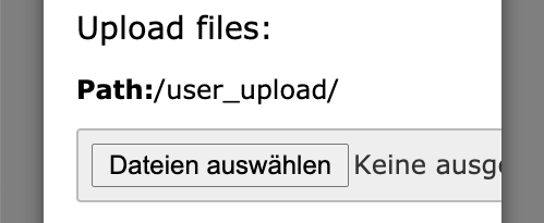
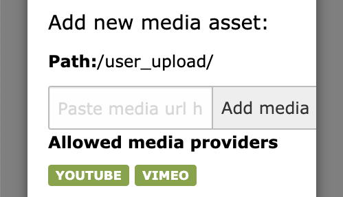
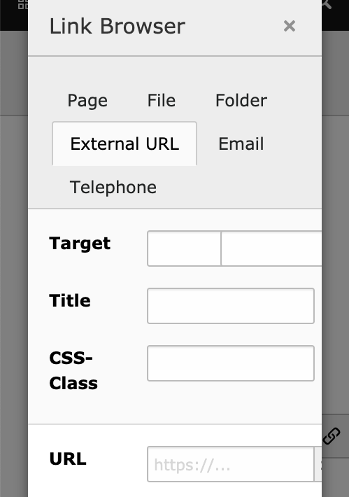
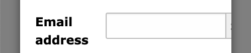
There are some input elements that are cut off:
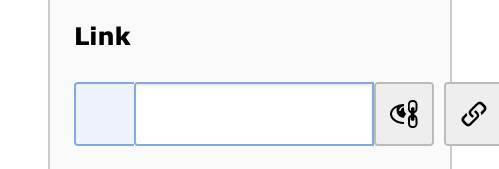
- In General: Link
- In Access: Usergroup Access Rights
- Lightbox File selector: "Upload files" and "Create new folder"
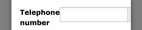
- Lightbox Link Browser: "Upload files", "Add new media asset", "Create new folder", "Target", "URL", "Email address" and "Telephone number"
- The date picker
Recommendation
- For inputs and selects you can set the max-width to 100% in CSS.
- For the elements in the "Usergroup Access Rights" find a responsive solution such as the vertical arrangement of the elements.

TYPO3-29 Some input elements are cut off when resized and cause horizontal scrolling
Pages/Tasks
- Create new page element: Page
- Create new page element: Shortcut
- Create new page element: External URL
Affected WCAG 2.1 Success criterions
- 1.4.4 Resize Text AA
- 1.4.10 Reflow (WCAG 2.1) AA
Affected components
- Form
- Text input
- Select
- File Upload
Description
A user should be able to resize a website up to 200% without text getting clipped or truncated. It mostly works when the user hides the .scaffold-content-navigation.
There are some input elements that are cut off:
- In General: URL Segment
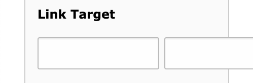
- In Behaviour: Link Target
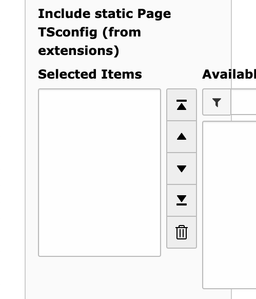
- In Resources: Include static Page TSconfig (from extensions)
- In Resources (Lightbox File selector): "Upload files", "Add new media asset" and "Create new folder"
- In Access: Usergroup Access Rights
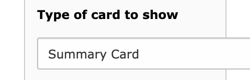
- In Social Media: Type of card to show
- The date picker
<div class="form-control-wrap" style="max-width: 804px" id="t3js-form-field-slug-id5f690768876f4205447836">
<select id="tceforms-select-5f561a719f4c6074251074" name="data[pages][2][twitter_card]" data-formengine-validation-rules="[{"type":"select","minItems":0,"maxItems":99999}]" class="form-control form-control-adapt">
<option value="summary" data-icon="" selected="selected">Summary Card</option><option value="summary_large_image" data-icon="">Summary Card with a large image</option>
</select>
Recommendation
- For inputs and selects you can set the max-width to 100% in CSS.
- For the elements in the "Include static Page TSconfig (from extensions)" and "Usergroup Access Rights" find a responsive solution such as the vertical arrangement of the elements.
TYPO3-36 No error suggestion for required URL input
Pages/Tasks
- Create new page element: External URL
Affected WCAG 2.1 Success criterions
- 3.3.1 Error Identification A
- 3.3.3 Error Suggestion AA
Affected components
- Text input
Description
The error is marked with a red exclamation mark, the input's border is red, the error message is only visible after saving the form, within an alert using following phrase: "The fields marked with an exclamation mark are not yet correctly filled in. Please complete them properly."
Error message should be displayed directly nearby the input, the name or purpose of the input should get visible.
If suggestions for correction are known, then the suggestions should get provided to the user, unless it would jeopardize the security or purpose of the content.
Recommendation
- Set the error message directly nearby the inputs and insert name or purpose of the input.
- If suggestions are known, add them.

TYPO3-39 Form elements have insufficient color contrast and insufficient focus style
Pages/Tasks
- Create content element: Header Only
- Create content element: Regular Text Element
- Create content element: Text & Images
- Create content element: Images Only
- Create content element: Text & Media
Affected WCAG 2.1 Success criterions
- 1.4.11 Non-Text Contrast (WCAG 2.1) AA
- 2.4.7 Focus Visible AA
Affected components
- Text input
- Select
- Textarea
Description
The form inputs and selects in the Edit section have an insufficient contrast ratio of 2.37:1 (border color: #6DAAE0, background color #FAFAFA), see WebAIM Color Contrast Checker
The elements get a subtle box-shadow and the border-color changes from #6DAAE0 to #4392D7, which is an insufficient contrast change from 1.33:1, see WebAIM Color Contrast Checker
.has-change .form-control {
  border: 1px solid #6daae0;
}

.has-change .form-control:focus {
  border-color: #4392d7;
}
Recommendation
To fulfill the minimum contrast ratio for form elements, implement the following:
- Increase the contrast ratio of the border color for the form elements to a minimum value of 3:1.
- Increase the contrast ratio of the border color for the focussed form to a minimum value of 3:1.
TYPO3-63 Create new content element buttons use the same ID
Pages/Tasks
- Edit page content
Affected WCAG 2.1 Success criterions
- 4.1.1 Parsing A
Affected components
- Link
Description
The ID-attribute value must be unique, the div surrounding the "Create new content element" buttons use the same ID.
<div class="t3js-page-new-ce t3-page-ce-wrapper-new-ce" id="colpos-0-page-7-5f72f23fc4eea013131177">
Recommendation
To fix this issue ensure that every surrounding div gets a unique ID-attribute.
TYPO3-28 Buttons, Links and Icons have no descriptive text
Pages/Tasks
- Create new page element: Page
- Create new page element: Shortcut
- Create new page element: External URL
- Delete page
- Create content element: Header Only
- Create content element: Regular Text Element
- Create content element: Text & Images
- Create content element: Images Only
- Create content element: Text & Media
- Edit page content
- Delete content element
Affected WCAG 2.1 Success criterions
- 1.1.1 Non-text Content A
- 2.4.4 Link Purpose (In Context) A
- 2.5.3 Label in Name (WCAG 2.1) A
Affected components
- Button
- Link
- Image
Description
When navigating to a button, a descriptive text must be presented to screenreader users to indicate the function of the button.
The buttons in the .tab-content area and "Create new relation"-Popup use only the title attribute. Many user agents do not expose the title in an accessible manner as required by the specification (e.g. requiring a pointing device such as a mouse to cause a tooltip to appear, which excludes keyboard-only users and touch-only users, such as anyone with a modern phone or tablet).
It affects all buttons using <a>- or <button>-tags in the following spans and divs:
<div class="btn-toolbar" role="toolbar" aria-label="">
<span class="input-group-btn">
<div class="btn-group-vertical">
<div class="btn-group">
<table class="table table-striped table-hover" id="typo3-filelist">
<div class="t3-page-ce-header">
Also affected: the icons in the .input-group-addon.input-group-icon:
<span class="icon-markup">
Recommendation
Place text content within the elements. You can achieve this with one of the following examples:
- Add an alt-text to the image in the button
- Keep the title-Attribute and add an extra text for screenreader users <span class="sr-only">Text</span>
TYPO3-37 Checkboxes in File Selector/Filelist have missing focus style
Pages/Tasks
- Create new page element: Page
- Create new page element: Shortcut
- Create new page element: External URL
- Create content element: Header Only
- Create content element: Regular Text Element
- Create content element: Text & Images
- Create content element: Images Only
- Create content element: Text & Media
Affected WCAG 2.1 Success criterions
- 2.4.7 Focus Visible AA
Affected components
- Checkbox
Description
When you navigate with your keyboard to an interactive element, you should see a visible focus style. This success criterion helps to know which element has the keyboard focus. The checkboxes in File Selector/Filelist don't change their style when they receives focus.
<td class="col-clipboard" valign="top">
  <label class="btn btn-default btn-checkbox">
    <input type="checkbox" class="typo3-bulk-item" name="file_0" value="0">
    <span class="t3-icon fa"></span>
  </label>
</td>
Recommendation
Add a visible focus style to the checkbox. You can achieve this with one of the following examples:
- add a visible border to the checkboxes, when focussed.
- when focussed, change the checkbox background color to another color, which has a contrast ratio of 3:1 to the normal background color.
TYPO3-38 Text in help-block and checkboxes in Image Metadata have an insufficient color contrast
Pages/Tasks
- Create content element: Header Only
- Create content element: Regular Text Element
- Create content element: Text & Images
- Create content element: Images Only
- Create content element: Text & Media
Affected WCAG 2.1 Success criterions
- 1.4.3 Contrast (Minimum) AA
Affected components
- Text
Description
The text in the .help-block and the checkboxes in the "Image Metadata" have an insufficient color contrast of 2.47 (foreground color: #6daae0, background color: #ffffff), see: WebAIM Color Contrast Checker
Recommendation
- Ensure that the contrast between foreground and background colors meets a contrast ratio of 4.5:1

TYPO3-43 Enhance rich text editor with further features for accessibility
Pages/Tasks
- Create content element: Regular Text Element
- Create content element: Text & Images
- Create content element: Text & Media
Affected WCAG 2.1 Success criterions
- 1.3.1 Info and Relationships A
- 3.1.2 Language of Parts AA
Affected components
- Text
Description
The CKEditor provides a WCAG 2.0 compliant usage (https://ckeditor.com/docs/ckeditor4/latest/guide/dev_wcag.html), which already enables accessible editing of rich text in TYPO3.
Nonetheless, at the current state, the editor doesn't help the editor with creating accessible content. For example, if the editor uses a wrong heading structure, the rich text editor doesn't recognize this error. Another example: If the editor creates the text in another language, there is no easy way to add the correct lang-attributes to this text.
Recommendation
For further optimizations in regards to accessibility, we recommend to integrate already available plugins, which help the editor with the creation of accessible content:
- To check if the created content is accessible use the Plugin Accessibility Checker.
- To set the right language for content use the Language Plugin.
TYPO3-46 Inputs in Media Adjustments do not inform the user of the required information
Pages/Tasks
- Create content element: Text & Images
- Create content element: Images Only
- Create content element: Text & Media
Affected WCAG 2.1 Success criterions
- 3.3.1 Error Identification A
- 3.3.2 Labels or Instructions A
- 3.3.3 Error Suggestion AA
Affected components
- Number input
Description
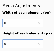
Inputs width and height in the "Tab Images or Media" and in "Media Adjustments" do not inform the user of the required information.
- The inputs are set min="0" and max="1999", the user doesn't receive this information. The help text is "Remaining characters: 4".
- If the user enters a wrong number, the label only gets a red callsign in front of it, no text information about what is wrong.
<input type="number" id="formengine-input-5f6ba4d14d019037710909" class="form-control t3js-clearable hasDefaultValue t3js-charcounter-initialized" data-formengine-validation-rules="[{"type":"int"},{"type":"range","upper":1999}]" data-formengine-input-params="{"field":"data[tt_content][NEW5f6ba4d0606f3711849919][imagewidth]","evalList":"int","is_in":""}" data-formengine-input-name="data[tt_content][NEW5f6ba4d0606f3711849919][imagewidth]" maxlength="4" min="0" max="1999" data-formengine-input-initialized="true">Recommendation
To fix this issue, apply the following implementation:
- Add the information in the label.
- Inform the user in the error message about the wrong entry.
TYPO3-45 Image manipulation options and crop area not accessible via keyboard, inputs are not associated with their labels, missing text alternatives for buttons and images
Pages/Tasks
- Create content element: Text & Images
- Create content element: Images Only
- Create content element: Text & Media
Affected WCAG 2.1 Success criterions
- 1.1.1 Non-text Content A
- 1.4.3 Contrast (Minimum) AA
- 2.1.1 Keyboard A
- 2.5.1 Pointer Gestures (WCAG 2.1) A
- 4.1.2 Name, Role, Value A
Affected components
- Button
- Image
- Radio Button
- Label
Description
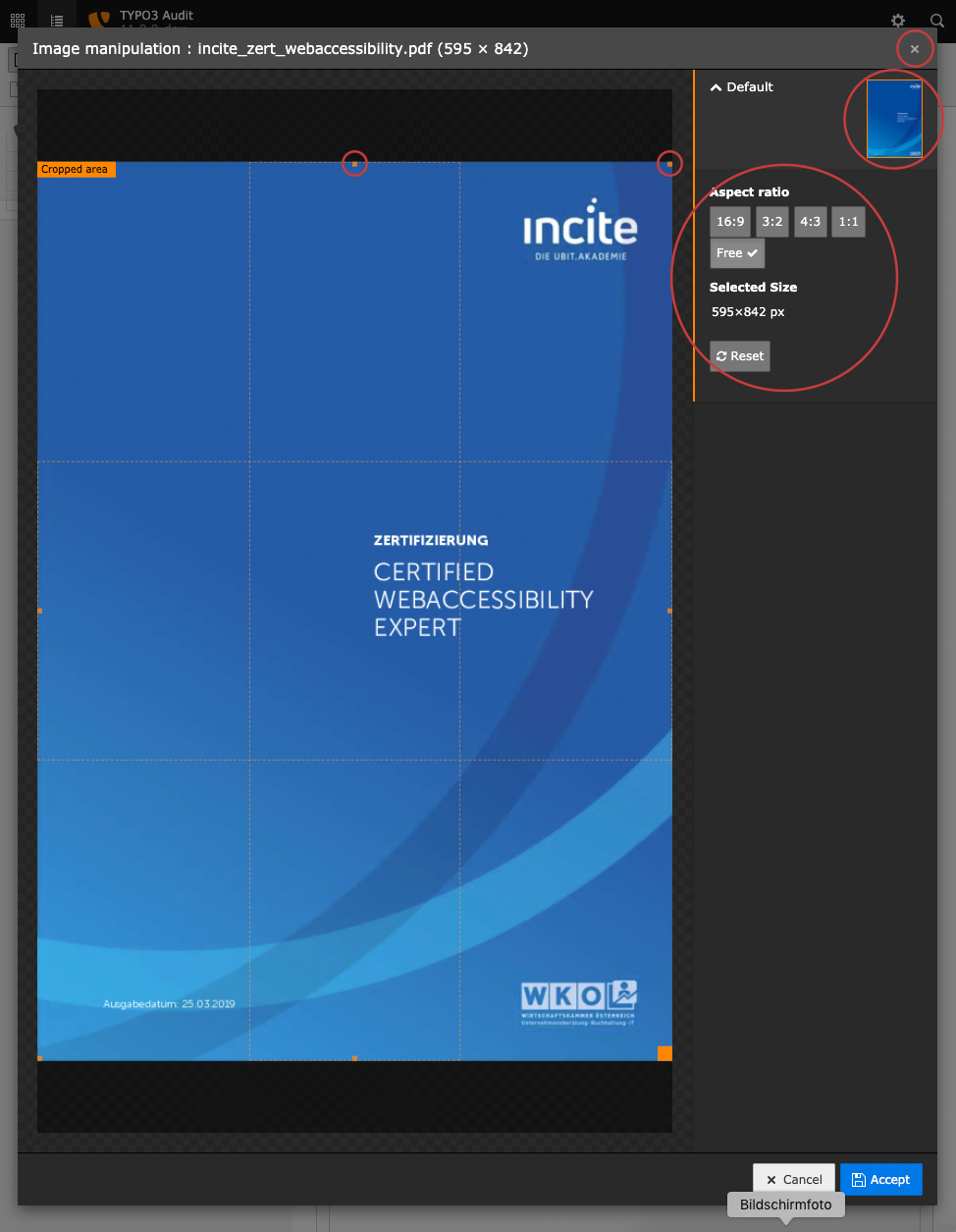
There are several issues with the "Image manipulation" modal:
- The close button doesn't have discernible text, screenreaders have no information about this button.
- The image thumbnail has no alternative text.
- The options in aspect ratio and the Reset button have an insufficient color contrast of 4.47 (foreground color: #ffffff, background color: #777777), see WebAIM Color Contrast Checker.
- The options in aspect ratio can't be activated via keyboard.
- The inputs in the aspect ratio are not associated with their labels.
- The handles in the crop area can't be activated and changed via keyboard.
Recommendation
To fix these issues apply the following implementation:
- Add a (sr-only) text for screenreaders to the close button.
- Add an alternative text to the image thumbnail.
- Increase the contrast ratio of the foreground and background color for the inputs and buttons to a minimum value of 4.5:1.
- Use the space or enter key to activate the buttons in aspect ratio.
- Associate the inputs in the aspect ratio with their labels using their IDs.
- Find an accessible solution for the crop area, let activate the handles, let change the position of the handles and the area with the arrow keys.
TYPO3-44 Drag and Drop in Images and Media elements can't be operated via keyboard
Pages/Tasks
- Create content element: Text & Images
- Create content element: Images Only
- Create content element: Text & Media
Affected WCAG 2.1 Success criterions
- 2.5.1 Pointer Gestures (WCAG 2.1) A
- 2.1.1 Keyboard A
Affected components
- Button
Description
All functionality that uses multipoint or path-based gestures for operation must be operated with a single pointer without a path-based gesture, unless a multipoint or path-based gesture is essential. The Drag and Drop Option of images and media files can't be operated via keyboard.
<span class="btn btn-default sortableHandle" data-id="NEW5f6a6922a32dd370230308" title="Move this item">
Recommendation
To fix these issues apply a single pointer solution for keyboard users.
- Use arrow buttons, similar to the buttons in the "Usergroup Access Rights" section.
- Use a submenu for the sorting function.
TYPO3-48 Headline and buttons in the modal-severity-info have insufficient color contrast
Pages/Tasks
- Create new page element: Page
- Create new page element: Shortcut
- Create new page element: External URL
- Create content element: Header Only
- Create content element: Regular Text Element
- Create content element: Text & Images
- Create content element: Images Only
- Create content element: Text & Media
Affected WCAG 2.1 Success criterions
- 1.4.3 Contrast (Minimum) AA
- 1.4.11 Non-Text Contrast (WCAG 2.1) AA
Affected components
- Text
- Button
Description
Headline and the "Close", "View without changes" and "Save changes and view" buttons in the .modal-severity-info Modal have insufficient color contrast of 2.47 (foreground color: #ffffff, background color: #6daae0), see WebAIM Color Contrast Checker.
<h4 class="t3js-modal-title modal-title">Do you want to save before viewing?</h4>
<button class="t3js-modal-close close">
<button class="btn btn-info" name="discard"><span>View without changes</span></button>
<button class="btn t3js-active btn-info" name="save"><span>Save changes and view</span></button>
Recommendation
To fix this issue increase the contrast to a contrast ratio of minimum 4.5:1.

TYPO3-49 Context menu not accessible via keyboard
Pages/Tasks
- Delete page
- Delete content element
Affected WCAG 2.1 Success criterions
- 2.1.1 Keyboard A
Affected components
- Link
- Menu
Description
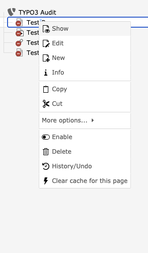
The context menu, which includes important functionality like deleting a page, is not accessible with the keyboard.
For keyboard users the only possibility to delete a page is in the "Edit page properties" section, the context (right mouse click) menu in the pagetree isn't accessible via keyboard.
The focus should be moved to it when it is opened, and the arrow keys should work inside to select an element.
<a class="list-group-item" data-callback-action="deleteRecord" data-title="Delete record (!)" data-message="Are you sure you want to delete 'Test Shortcut'?" data-button-close-text="Cancel" data-button-ok-text="Delete"> ...
Recommendation
It should be implemented as WAI-ARIA menu (see https://www.w3.org/TR/wai-aria-practices-1.1/#menu)
TYPO3-47 Headline and buttons in the modal-severity-warning have an insufficient color contrast
Pages/Tasks
- Create new page element: Page
- Create new page element: Shortcut
- Create new page element: External URL
- Delete page
- Create content element: Header Only
- Create content element: Regular Text Element
- Create content element: Text & Images
- Create content element: Images Only
- Create content element: Text & Media
Affected WCAG 2.1 Success criterions
- 1.4.3 Contrast (Minimum) AA
- 1.4.11 Non-Text Contrast (WCAG 2.1) AA
Affected components
- Text
- Button
Description
The headline and the "Close" and "Save and close" or "Yes, delete this record" buttons in the .modal-severity-warning Modal have an insufficient color contrast of 2.15 (foreground color: #ffffff, background color: #e8a33d), see WebAIM Color Contrast Checker.
<h4 class="t3js-modal-title modal-title">Do you want to close without saving?</h4>
<button class="t3js-modal-close close">
<button class="btn t3js-active btn-warning" name="save"><span>Save and close</span></button>
Recommendation
To fix this issue, increase the contrast to a contrast ratio of minimum 4.5:1.

TYPO3-51 Toggle checkboxes have invalid attribute 1, screenreaders get a wrong status
Pages/Tasks
- Create new page element: Page
- Create new page element: Shortcut
- Create new page element: External URL
- Create content element: Header Only
- Create content element: Regular Text Element
- Create content element: Text & Images
- Create content element: Images Only
- Create content element: Text & Media
Affected WCAG 2.1 Success criterions
- 4.1.1 Parsing A
- 4.1.2 Name, Role, Value A
Affected components
- Checkbox
Description
Toggle checkboxes have an attribute 1, which is an invalid attribute and not allowed on <input>-tags.
<div class="checkbox checkbox-type-toggle"> <input type="checkbox" class="checkbox-input" value="1" data-formengine-input-name="data[tt_content][NEW5f6d04e08c2cd753533338][sectionIndex]" onclick="document.editform['data[tt_content][NEW5f6d04e08c2cd753533338][sectionIndex]'].value=this.checked?(document.editform['data[tt_content][NEW5f6d04e08c2cd753533338][sectionIndex]'].value|1):(document.editform['data[tt_content][NEW5f6d04e08c2cd753533338][sectionIndex]'].value&0);TBE_EDITOR.fieldChanged('tt_content','NEW5f6d04e08c2cd753533338','sectionIndex','data[tt_content][NEW5f6d04e08c2cd753533338][sectionIndex]');" checked="checked" 1="" id="data_tt_content_NEW5f6d04e08c2cd753533338_sectionIndex_0_5f6d04e0b99f3467677485">When the user activates a toggle checkbox, the value of the visible checkbox for the screenreader doesn't change. Therefore the screenreader doesn't get right value of the checkbox.
<input type="hidden" name="data[tt_content][5][sectionIndex]" value="1">
Recommendation
To fix this issue, add the following implementations:
- Delete the attributes 1.
- Use just one <input>-tag, delete the hidden one.
TYPO3-52 Textarea Page TSconfig has an invalid alt attribute
Pages/Tasks
- Create new page element: Page
- Create new page element: Shortcut
- Create new page element: External URL
Affected WCAG 2.1 Success criterions
- 4.1.1 Parsing A
Affected components
- Textarea
Description
The textarea Page TSconfig has an invalid alt attribute.
<textarea class="text-monospace enable-tab t3editor" alt="pages > TSconfig"
Recommendation
To fix this issue, delete the alt attribute and associate the textarea with its label.
TYPO3-50 Span elements in the form-wizards-items-aside have not allowed alt attributes
Pages/Tasks
- Create new page element: Page
- Create new page element: Shortcut
- Create new page element: External URL
- Create content element: Header Only
- Create content element: Regular Text Element
- Create content element: Text & Images
- Create content element: Images Only
- Create content element: Text & Media
Affected WCAG 2.1 Success criterions
- 4.1.1 Parsing A
Affected components
- Link
Description
Some span elements in the .form-wizards-items-aside have not allowed alt attributes.
<span alt="Canonical link" title="Canonical link">
<span alt="Browse for records" title="Browse for records">
<span alt="Link" title="Link">
Recommendation
To fix this issue, set the alt attribute on the contained <img> tag.
TYPO3-53 Buttons with icons don't have a discernible title in mobile view
Pages/Tasks
- Search
Affected WCAG 2.1 Success criterions
- 1.1.1 Non-text Content A
- 4.1.2 Name, Role, Value A
Affected components
- Button
Description
When you are on a smaller screen, the top menu bar shows buttons with icons without a text for maximizing the menu, opening the settings and the search. Those buttons don't have a discernible title.
<button class="topbar-button topbar-button-modulemenu t3js-topbar-button-modulemenu" title="Minimize/maximize module menu">
  ...
</button>

<button class="topbar-button topbar-button-toolbar t3js-topbar-button-toolbar">
  ...
</button>

<button class="topbar-button topbar-button-search t3js-topbar-button-search">
 ...
</button>
Although there is a title attribute with the module menu button, this is not sufficient to support all assistive technologies.
Recommendation
Add a discernible text to all buttons.
To accomplish this, use one of the following techniques:
- add the attribute aria-label to the <button>-Tag
- add a screenreader-only text between the opening and closing button-Tag
- add the attribute aria-labelledby to the <button>-Tag
TYPO3-54 Search modal dialog cannot be used with a keyboard
Pages/Tasks
- Search
Affected WCAG 2.1 Success criterions
- 1.3.1 Info and Relationships A
- 2.1.1 Keyboard A
- 2.4.4 Link Purpose (In Context) A
- 4.1.2 Name, Role, Value A
Affected components
- Dialog
Description
When you type text in the search input field, a modal dialog with the search results opens. This dialog with all including search results cannot be reached with the keyboard. As soon as the input field loses focus, the dialog gets closed.
The modal dialog also has an invalid ARIA role="menu", which would require to have additonal child nodes with other ARIA roles like role="menuitem":
<div class="dropdown-menu" role="menu">
  ...
</div>
The ARIA role="menu" is wrong in this context, as the modal dialog doesn't contain a menu.
Before the search model dialog there is an empty link, which seems to control the visibility of the dialog:
<a href="#" class="dropdown-toggle t3js-toolbar-search-dropdowntoggle" data-toggle="dropdown" aria-expanded="false"></a>
Empty links should be avoided.
Recommendation
- Make the search modal dialog available for keyboard usage and use the best practice design pattern for modal dialogs for the search dialog.
- Remove the empty link or at least make it invisible for screenreader users, for example with aria-hidden="true".
https://www.w3.org/TR/wai-aria-practices-1.1/examples/dialog-modal/dialog.html

TYPO3-55 Button "Show all" in search dialog modal has insufficient color contrast
Pages/Tasks
- Search
Affected WCAG 2.1 Success criterions
- 1.4.3 Contrast (Minimum) AA
Affected components
- Button
Description
When you type text in the search input field and the search modal dialog appears with multiple results, there is a button at the end which says "Show all". This button has insufficient color contrast of 2.7 (foreground color: #ABD0F0, background color: #0078E5), see WebAIM Color Contrast Checker.
<a href="#" class="btn btn-primary pull-right t3js-live-search-show-all">Show All</a>
Recommendation
To fix this issue, increase the contrast to a contrast ratio of minimum 4.5:1.
TYPO3-56 Icons in the search dialog modal are missing a discernible name when the icon adds additional information
Pages/Tasks
- Search
Affected WCAG 2.1 Success criterions
- 1.1.1 Non-text Content A
- 1.3.1 Info and Relationships A
Affected components
- Image
Description
When you type text in the search input field and the search modal dialog appears with multiple results, the results have related icons before each result. If it is a page, a page icon is shown before the title. If it is an inactive page, the inactive page icon is shown. These icons give additional information about the status of the page, but they have an empty alternative text. Without alternative text, screenreader users don't have information whether it's an active or inactive search result item (this issue exists with different types of search result items, not only pages).
The HTML structure of icons with inactive status is a little bit confusing as it consists of two combined images and therefore a screenreader will read both images. It would be better to only use one image for describing the type and status of the search result item as the two images are not logically related to each other.
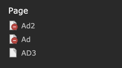
<span class="t3js-icon icon icon-size-small icon-state-default icon-apps-pagetree-page-default" data-identifier="apps-pagetree-page-default">
  <span class="icon-markup">
    <img src="/typo3/sysext/core/Resources/Public/Icons/T3Icons/apps/apps-pagetree-page-default.svg" width="16" height="16" alt="">
  </span>
  <span class="icon-overlay icon-overlay-hidden">
    <img src="/typo3/sysext/core/Resources/Public/Icons/T3Icons/overlay/overlay-hidden.svg" width="16" height="16" alt="">
  </span>
</span>
Recommendation
Add alternative text to the icons, which describes, if the search result item has an active or inactive status. Also it is recommended to only use one image to show an inactive page item.
TYPO3-57 Search result list is missing correct HTML markup and additional search information
Pages/Tasks
- Search
Affected WCAG 2.1 Success criterions
- 1.3.1 Info and Relationships A
- 4.1.3 Status Messages (WCAG 2.1) AA
Affected components
- Text
Description
When you type text in the search input field and the search modal dialog appears with a list of search results. There are several accessibility issues with the search result.
If a visual presentation looks like a list, it should also have have HTML markup for a list <ul>. At the moment the different types of the search results (Page, Backend user, ..) are capsuled with <h3> and the search result row is capsuled with <div class="autocomplete-suggestion">.
<div class="t3js-toolbar-item-search" style="">
  <h3 class="dropdown-headline">Backend user</h3>
  <div class="autocomplete-suggestion" data-index="0">
    ..
  </div>
<div>
The search result modal shows a maximum of 5 search results, more results can be viewed with the button "Show all". Information about the total search result count is missing.
The search result gets updated automatically when a user types text into the search input field. A screenreader user doesn't receive any information about the automatically updated search result list.
Recommendation
- Use list markup <ul> and <li> for the search results.
- Add an additional heading <h2>x results found</h2> before the result list. This helps all users.
- When the search result gets updated, add <span role="status">Search complete. x results found</span> inside the search modal dialog. This way also screenreader users get informed about the updated search result list.
More information about status messages can be found here: https://www.w3.org/WAI/WCAG21/Techniques/aria/ARIA22.html
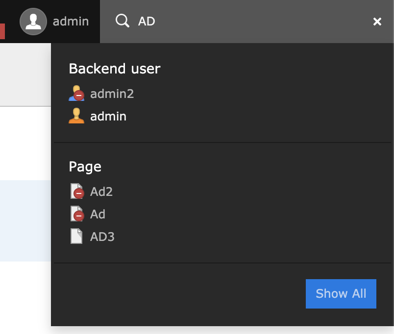
TYPO3-58 User has little information about search functionality
Pages/Tasks
- Search
Affected WCAG 2.1 Success criterions
- 3.3.2 Labels or Instructions A
Affected components
- Text
Description
The search input field is very powerful when you know how to use it.
There are several terms which you can enter to filter specific search result, for example:
- #page: search in certain pages
- #content: search only in content
- Digit searches for page ids
A description of how the search field can be used, would be a great help for all users. At the moment there is only a little hint shown, when there are no results found (see screenshot).
If you enter a digit, the page with this page id will be shown. The search input field needs a minimum of 2 characters, so only page ids greater or equal than 10 are found. This seems more like a bug than an accessibility issue, but would be great, if it gets fixed for a better experience.
Recommendation
Add a brief description on how to use the search. Provide this information as an additional description to the search input field with aria-describedby.
Further Informationhttps://www.w3.org/WAI/tutorials/forms/instructions/
TYPO3-59 Missing descriptive title for collapse/expand button
Pages/Tasks
- Search
Affected WCAG 2.1 Success criterions
- 1.1.1 Non-text Content A
- 2.4.4 Link Purpose (In Context) A
Affected components
- Link
- Image
Description
When you type text in the search input field and click on the button "Show all" in the search modal dialog, a page with the search results opens. With the arrow-icon, the user can expand/collapse each type of search result. This button (see screenshot) has no descriptive text (the title-attribute is not sufficient).
<a href="#" title="Collapse table" class="pull-right t3js-toggle-recordlist" data-table="tt_content" data-toggle="collapse" data-target="#recordlist-tt_content" aria-expanded="true">
  <span class="collapseIcon">
    <span class="t3js-icon icon icon-size-small icon-state-default icon-actions-view-list-collapse" data-identifier="actions-view-list-collapse">
      <span class="icon-markup">
        <img src="/typo3/sysext/core/Resources/Public/Icons/T3Icons/actions/actions-view-list-collapse.svg" width="16" height="16" alt="">
      </span>
    </span>
  </span>
</a>
Also, for this functionality, a <button> should be used instead of <a> as it is an interaction on the same page rather than opening a new page.
Recommendation
- Add a descriptive text for the button, for example by adding the alternative-attribute to the image or by using aria-label.
- Convert the link <a> to a button.

TYPO3-62 Page header draggable from hidden content elements and the functions included have an insufficient color contrast
Pages/Tasks
- Edit page content
- Delete content element
Affected WCAG 2.1 Success criterions
- 1.4.3 Contrast (Minimum) AA
- 1.4.11 Non-Text Contrast (WCAG 2.1) AA
Affected components
- Link
Description
Page header draggable from hidden content elements .t3-page-ce-hidden have an insufficient color contrast by setting opacity: .4, only on mouse over they get normal color contrast, not on focus.
<div class="t3-page-ce t3-page-ce-hidden t3js-hidden-record t3js-page-ce t3js-page-ce-sortable ui-draggable" id="element-tt_content-4" data-table="tt_content" data-uid="4" style="position: relative;">
Edit, hide/show and the delete function in the .t3-page-ce-header-draggable have an insufficient color contrast by setting opacity: .3, only on mouse over they get normal color contrast, not on focus.
<div class="t3-page-ce-header-icons-right"><div class="btn-toolbar"> <div class="btn-group btn-group-sm"> ...
Recommendation
To fix these issues, add the following implementations:
- Set the opacity of both elements to 1
- Find another visible identification for hidden content elements, like a background pattern, e.g. hatching
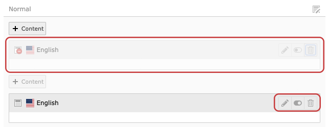
TYPO3-60 Page column header has insufficient color contrast and no <h2>-tag, the icon has no discernible text
Pages/Tasks
- Edit page content
- Delete content element
Affected WCAG 2.1 Success criterions
- 1.4.3 Contrast (Minimum) AA
- 1.4.11 Non-Text Contrast (WCAG 2.1) AA
- 1.1.1 Non-text Content A
Affected components
- Text
- Image
Description
Text must have a color contrast ratio of 4.5:1, icons a color contrast ratio of 3:1. The headline in .t3-page-column-header has insufficient color contrast of 2.84 (foreground color: #999999, background color: #ffffff), see WebAIM Color Contrast Checker.
Since this is a heading, a <h2>-tag should be used.
A screenreader doesn't know the purpose of the link because the link and icon have no discernible text.
<div class="t3-page-column-header"> <div class="t3-page-column-header-icons"> </div> Normal </div>
<div class="t3-page-column-header-icons">
<a href="/typo3/index.php?route=%2Frecord%2Fedit&token=b4c02a5aa1f05e67a9a0738e41e02f654b83131b&edit[tt_content][4,5,6,7,8]=edit&recTitle=Test%20Content%20Page&returnUrl=%2Ftypo3%2Findex.php%3Froute%3D%252Fmodule%252Fweb%252Flayout%26token%3D6a8f22399d2e4668426eecff9e3de36271448da8%26id%3D7" title="">
<span class="t3js-icon icon icon-size-small icon-state-default icon-actions-document-open" data-identifier="actions-document-open">
<span class="icon-markup">
<img src="/typo3/sysext/core/Resources/Public/Icons/T3Icons/actions/actions-document-open.svg" width="16" height="16" alt="">
</span>
</span>
</a>
</div>Recommendation
To fix this issue, add the following implementations:
- Increase the contrast of the text to a contrast ratio to a minimum of 4.5:1
- Increase the contrast of the icon to a contrast ratio to a minimum of 3:1
- Add a <h2>-tag
Add a discernible text as alt-text to the icon e.g. "Edit page content"
TYPO3-61 Main headline edit function not visible and not accessible via keyboard
Pages/Tasks
- Edit page content
Affected WCAG 2.1 Success criterions
- 1.4.13 Content on Hover or Focus (WCAG 2.1) AA
- 2.1.1 Keyboard A
Affected components
- Link
Description
The main headline is editable, the user doesn't get aware of this function, only on mouse over the cursor changes into a pencil, the information opens in a tooltip via click.
Every interactive component must be accessible via keyboard, this edit function is not accessible via keyboard.
<h1 class="t3js-title-inlineedit">Test Content Page<a class="hidden" href="#" data-action="edit"><span class="t3-icon fa fa-pencil"></span></a></h1>
Recommendation
To fix this issue, remove the class .hidden to show the function and simply enable keyboard focus.
TYPO3-64 Form input fields in the search detail page have insufficient color contrast and focus style
Pages/Tasks
- Search
Affected WCAG 2.1 Success criterions
- 1.4.11 Non-Text Contrast (WCAG 2.1) AA
- 2.4.7 Focus Visible AA
Affected components
- Text input
- Select
Description
The form inputs and selects at the search detail page (choose "Show all" in search or activate search fields on page view) have an insufficient contrast ratio of 1.8:1 (border color: #BABBBA, background color #F9FAF9), see WebAIM Color Contrast Checker.
When focussed, the elements get a subtle box-shadow and the border-color changes from #BABBBA to #AAAAAA, which is an insufficient contrast change from 1.2:1, see WebAIM Color Contrast Checker.
Recommendation
To fulfill the minimum contrast ratio for form inputs, implement the following:
- increase the contrast ratio of the border color for the form inputs and selects to a minimum value of 3:1.
- increase the contrast ratio of the border color for the focussed form inputs and selects to a minimum value of 3:1.

TYPO3-65 Links in search detail view have no descriptive text or the text doesn't describe the purpose very well
Pages/Tasks
- Search
Affected WCAG 2.1 Success criterions
- 2.4.4 Link Purpose (In Context) A
- 3.2.4 Consistent Identification AA
Affected components
- Link
Description
When you search on a page and you see the search detail view with a list of search results, the search result items contain lots of linked icons. All of these links are missing a descriptive text for screenreaders, there is only a mouse over text available, which describes the link. For example "View the webpage":
<a class="btn btn-default" href="#" onclick="var previewWin = window.open('https:\/\/t3version10.ddev.site\/autogenerated-1\/team\/ad\/default-title','newTYPO3frontendWindow');previewWin.focus();
if (previewWin.location.href === 'https:\/\/t3version10.ddev.site\/autogenerated-1\/team\/ad\/default-title') { previewWin.location.reload(); };" title="" data-original-title="View webpage"><span class="t3js-icon icon icon-size-small icon-state-default icon-actions-view-page" data-identifier="actions-view-page">
    <span class="icon-markup">
<img src="/typo3/sysext/core/Resources/Public/Icons/T3Icons/actions/actions-view-page.svg" width="16" height="16" alt="">
    </span>
</span></a>
Other text doesn't describe the link purpose very well, for example "Page (3)" opens a filtered view of only page items. The number "3" stands for the number of found search results of type page.
The text of the link should be clear and unique for each unique action.
Recommendation
Use the mouseover texts as a descriptive text for screenreaders and make use of one of the following techniques:
- add the attribute aria-label to the <a>-Tag
- add a screenreader-only text between the opening and closing <a>-Tag
- add the attribute aria-labelledby to the <a>-Tag
- add the link purpose to the attribute alt of the <img>-Tag
For links that already have a text, improve the text in a way, so that the user understands the link purpose clearly. For example use "Edit pageXY", when the link leads to the edit view of pageXY.
For the number of a search result ("Page (3)"), it would be more understandable for all users to write "3 Pages found" or "Page (3 results)".
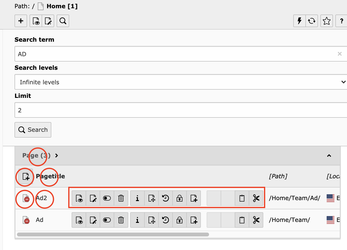
TYPO3-66 Menus and the select input field in search detail view get clipped off when zoomed
Pages/Tasks
- Search
- Module menu left
Affected WCAG 2.1 Success criterions
- 1.4.4 Resize Text AA
Affected components
- Select
- Link
- Menu
Description
On search detail view: when you zoom the font size to 200% in the browser (only font size), the select input field gets clipped off and the value is not readable anymore, see screenshot. The height of the select input field is defined with 32px.
<select class="form-control" name="search_levels" title="Search levels" id="search_levels"><option value="-1" selected="selected">Infinite levels</option><option value="0">This page</option><option value="1">1 level down</option><option value="2">2 levels down</option><option value="3">3 levels down</option><option value="4">4 levels down</option></select>
Some menu items of the module menu on the left side also get clipped of.
Recommendation
Don't use "px" units for heights or width of elements. Instead use relative units, like "em" or "rem".

TYPO3-67 "Site Management" is cut off in the module menu when text spacing is adjusted
Pages/Tasks
- Module menu left
Affected WCAG 2.1 Success criterions
- 1.4.12 Text Spacing (WCAG 2.1) AA
Affected components
- Text
Description
The module menu has a fixed width of 230px. When a user adjusts text spacing for better readability, the menu item "Site Management" is cut off in the menu, see screenshot.
Recommendation
Specify the size of the text container with "em" units.

TYPO3-68 Hidden links should not be accessible via keyboard in search detail view on smaller screens
Pages/Tasks
- Search
Affected WCAG 2.1 Success criterions
- 2.4.3 Focus Order A
Affected components
- Link
Description
When you search on a page and you see the search detail view with a list of search results, the search result items contain lots of linked icons. On a smaller screen, a part of these icons gets hidden and another linked icon with three dots appears to expand/collapse the hidden icons, see screenshot.
In the collapsed state the links still can be accessed with the keyboard, because the container for the links has a width of zero. This is not a proper technique for hiding content.
<span id="actions_pages_8" class="btn-group collapse-horizontal width collapse" aria-expanded="false" style="width: 0px;">
Recommendation
When the links are in a collapsed state, hide the links for keyboard access. This can be archived for example with a CSS style "display: none"
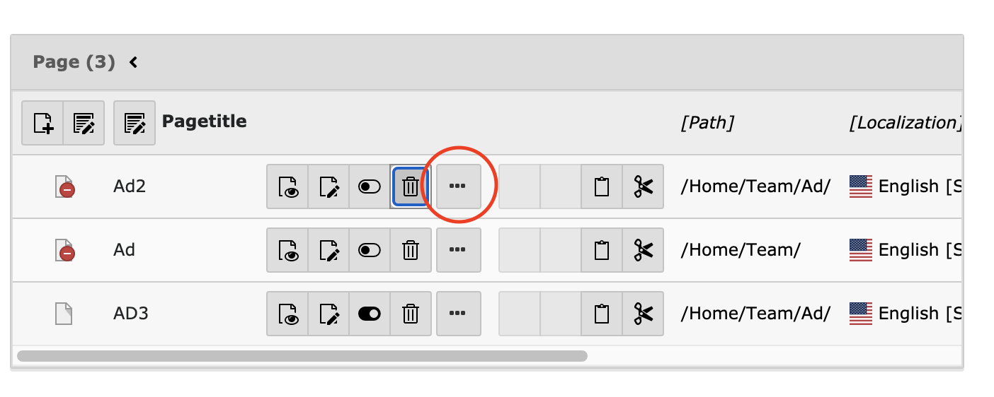
TYPO3-69 Unknown ARIA-attribute used in menu
Pages/Tasks
- Module menu left
Affected WCAG 2.1 Success criterions
- 4.1.1 Parsing A
Affected components
- Menu
Description
The module menu contains an unknown ARIA-attribute "aria-visible" which is not allowed.
<ul class="modulemenu-group-container" aria-visible="true" style="">
Recommendation
Remove the attribute aria-visible from the <ul>.
TYPO3-70 Module menu has insufficient color contrast ratio for icons and focus style
Pages/Tasks
- Module menu left
Affected WCAG 2.1 Success criterions
- 1.4.11 Non-Text Contrast (WCAG 2.1) AA
- 2.4.7 Focus Visible AA
Affected components
- Menu
Description
The focus style of menu items in the module menu has an insufficient contrast ratio of 2.6:1 (border color: #666766, background color #282928), see WebAIM Color Contrast Checker.
The contrast ratio of the following icons for menu items is also not sufficient: Page, Info, Redirects, Upgrade, Extensions, Backend users, Configuration. The background color for the white icon is too low in contrast.
Recommendation
Increase the contrast ratio of the focus style of menu items to a minimum ratio of 3:1.
Darken the background color for menu icons which are too low in contrast.
TYPO3-71 Make the navigation through module menu more efficient for keyboard users
Pages/Tasks
- Module menu left
Affected WCAG 2.1 Success criterions
- 2.4.1 Bypass Blocks A
Affected components
- Menu
Description
When the user tabs through the module menu on the left with the TAB key, the user has to go through each menu item to get to the next section in the CMS (which is the page tree menu). This is very cumbersome as a keyboard user has to tab through the whole menu, each time the page is loaded.
When a menu item is selected, the next focussable element with the TAB key should be the first interactive element in the opened content panel. When you select "Page" in the module menu, the next focussable element should be "Create new page" in the container <div class="scaffold-content t3js-scaffold-content ">.
<button class="svg-toolbar__btn" data-tree-icon="actions-page-new" title="Create new pages">
Recommendation
Make the module menu the same way navigable as the pagetree. Switching between menu items should be only possible with the arrow keys and not with the TAB key. This way, a keyboard user can skip navigating through the whole module menu.
TYPO3-72 Drag and drop of content elements isn't visible and can't be operated via keyboard
Pages/Tasks
- Edit page content
Affected WCAG 2.1 Success criterions
- 2.1.1 Keyboard A
- 2.5.1 Pointer Gestures (WCAG 2.1) A
Affected components
- Button
Description
All functionality that uses multipoint or path-based gestures for operation must be operated with a single pointer without a path-based gesture, unless a multipoint or path-based gesture is essential. The drag and drop option of content elements is only visible on mouseover and can't be operated via keyboard.
Recommendation
To fix these issues, apply the following implementations:
- Make the function visible e.g. through buttons
- Use a single pointer solution for keyboard users, e.g. arrow buttons, similar to the buttons in the "Usergroup Access Rights" section.
- Use a submenu for the sorting function.

TYPO3-73 Delete and paste dialogues don't include content element title
Pages/Tasks
- Edit page content
- Delete content element
Affected WCAG 2.1 Success criterions
- 2.4.6 Headings and Labels AA
Affected components
- Dialog
Description
The delete and paste dialogues don't include information about the content element to be inserted or deleted.
The paste dialog includes the record number, which isn't shown or known by the user.
<a data-content="6" data-title="6" data-severity="warning" class="t3js-paste t3js-paste-copy t3js-paste-after btn btn-default btn-sm" title="Paste after this record"><span class="t3js-icon icon icon-size-small icon-state-default icon-actions-document-paste-into" data-identifier="actions-document-paste-into">
Recommendation
To fix this issue, include the content element title in the delete and paste dialogues.
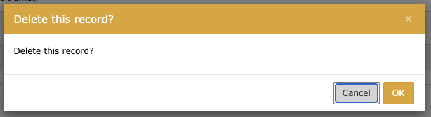

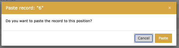
TYPO3-75 Mobile module menu links are missing link title
Pages/Tasks
- Module menu left
Affected WCAG 2.1 Success criterions
- 2.4.4 Link Purpose (In Context) A
- 4.1.2 Name, Role, Value A
Affected components
- Link
Description
When the module menu on the left is collapsed, only the icons without the titles are visible. When navigating to a link, the descriptive text must be presented to screen reader users to indicate the target of the link. The linked icons in the module menu have no descriptive text. The title-Attribute is not sufficient for all assistive technologies.
<button title="Page content" class="modulemenu-action t3js-modulemenu-action modulemenu-action-active" role="menuitem" id="web_layout" data-modulename="web_layout" data-link="/typo3/index.php?route=%2Fmodule%2Fweb%2Flayout&token=a283194fa743e2f53d933e31d8bb84c801ae0af8" data-navigationcomponentid="TYPO3/CMS/Backend/PageTree/PageTreeElement"> ... </button>
Recommendation
When the module menu is collapsed, make sure that there are accessible titles available for the menu links. One solution would be to remove the CSS style "display: none" from the actual title of the menu item.
<span class="modulemenu-name">Page</span>
TYPO3-76 Most of the content of the module menu is only available via the menu
Pages/Tasks
- Module menu left
Affected WCAG 2.1 Success criterions
- 2.4.5 Multiple Ways AA
Affected components
- Text
Description
Users prefer different ways to navigate through content. Some of the links in the module menu can be reached with the global search (Page module, Filelist module, Backend useres, Redirects, ...). Other links (Sites, Maintenance, ...) do not have an alternative way to view the content, only via the menu.
Recommendation
Provide multiple ways to reach each view in TYPO3. An alternative way could be to make the missing content also available in the global search.